Performance Development Chart: Visualize Performance Progress the Way YOU Want It
Visualize your athletes' progress over time with fully customizable Performance Development Charts, so you can clearly present exactly what matters most to you and your clients.Performance Development Chart gives you the power to create fully personalized, athlete- and sport-specific perfor
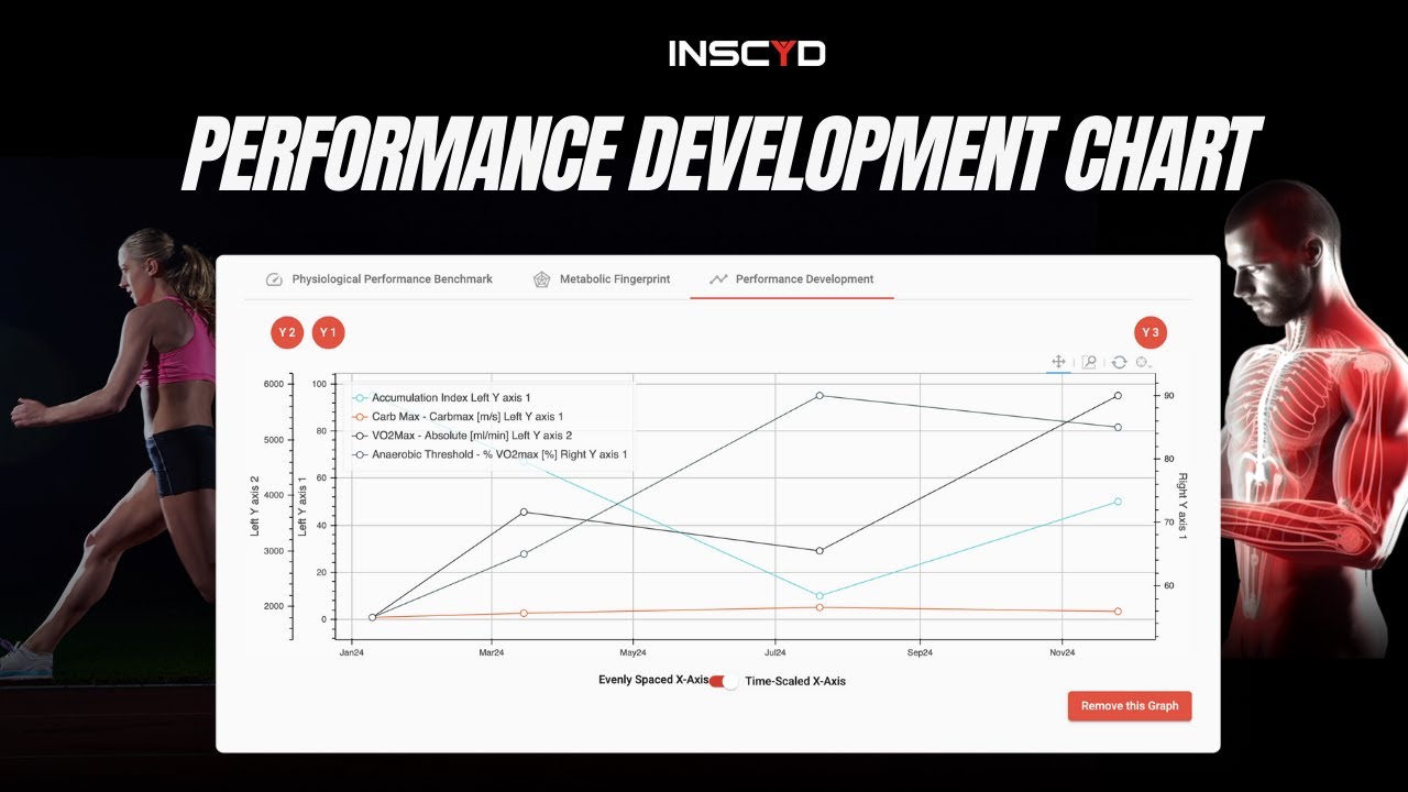

The Performance Development Chart is one of INSCYD's most powerful visualization tools for tracking athlete progress over time. Instead of showing you a static snapshot of where an athlete is today, the Performance Development Chart plots all of an athlete's test results on a single graph, allowing you to see how their key metrics have evolved across multiple test sessions. You can see how VO2 max, VLA max, threshold power, fat combustion rate, and other metrics have changed over months or even years of training.
This gives you a longitudinal view of athlete development that is simply not possible with conventional testing approaches that look at one metric in isolation. The chart also allows you to annotate specific training blocks or interventions, so you can see clearly which training approaches drove which adaptations. This is enormously valuable for refining your coaching approach over time and building evidence-based training protocols for different athlete types.
Now you do select the sport. Let's select cycling. And you can see by clicking this Y1 button, you will add a graph and you can define what you want to be listed on the on the X-axis on the Y axis and then you can configure additional axis as you like. So you can see that all the new metrics that you can now find in INSCYD are available on this drop-down list here. So you can choose whatever metric you want and decide therefore which metrics you want to show on the graph and which one you want to hide.
Because of the number of metrics on the val of metrics that is available in INSCYD you can add more graphs and you can basically stack those graphs in order to show and display all the metrics that are relevant to you. So you can have a total of up to three performance development charts to track whatever is important to you in a specific sport. So again it is specific to the sport and then for each sport you can configure up to three graphs which up to three y-axis per graph and you can choose freely which metrics you want to show on those axis.
Additionally you can for each graph decide how you want to scale the x-axis. You can choose between evenly scaled where the distance between each data point is equal or you can choose timecaled which basically means test points which are further apart also appear further apart in the graph. And then of course everything you set up here is reflected afterwards in the athletes performance center. So now, here in the Athletes' Performance Center, you can see that I have these three graphs which I configured before. And I can still choose, in the Athletes' Performance Center for each graph, which one I want to use, the time-scaled or the evenly scaled x-axis, individually.
This is specific to that test here. So you can change it no matter what you have in your default settings on the visualization page.


![[Tutorial] Training Zone Builder Update](https://cdn.prod.website-files.com/69fb420749df096c7fb865ef/69fdf1e0d26c1f6fe0d4c945_maxresdefault.jpeg)


![[Tutorial] Virtual Test & Performance Projection: Compare Training Outcomes in INSCYD](https://cdn.prod.website-files.com/69fb420749df096c7fb865ef/69fdf1e2a6495029773d8211_maxresdefault.jpeg)


![Create Training Plans Like Top Coaches [5 Steps]](https://cdn.prod.website-files.com/69fb420749df096c7fb865ef/69fdf1e491172a8381d183ad_maxresdefault.jpeg)